Two years ago, I set out to create a unique wedding website for my wife, Sithara, and me. The website, wedding.aravindnc.com, became a central part of our wedding experience, helping guests stay informed while giving us a space to share our story. Here’s a look behind the scenes of this labor of love.
You can visit our site here: wedding.aravindnc.com
Inspiration and Design
From the start, I wanted the website to reflect our personalities and preferences. My wife loves the color purple, so I chose it as the main theme color, balancing it with other pastel shades to create a soft, welcoming look. This color choice added a personal touch, and Sithara loved how it turned out.
The site features floral and nature-inspired elements to keep it elegant and joyful. I designed everything from scratch, including some custom SVG animations, to make the website truly our own.
Features and Functionality
To make the site practical and interactive for our guests, I added a few key features:
- View Directions: This button links directly to Google Maps, providing guests with directions to the wedding and reception venues.
- Add to Calendar: With a click, guests could save the event directly to their calendar, making it easier for them to remember the details.
- View Invitation: This button allowed users to download a PDF of our wedding invitation, which they could save or print as a keepsake.
These features not only added convenience but also showcased the power of a simple, functional web experience for event planning.
The Development Journey
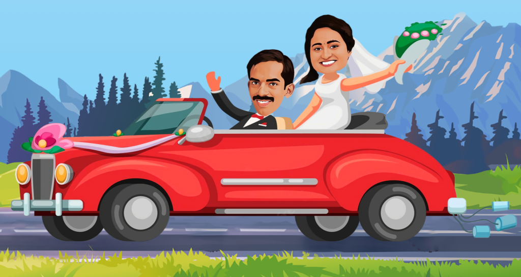
I built the website entirely from scratch using HTML, CSS, and JavaScript, aiming for a seamless, responsive design that would look good on any device. I also wanted to make it visually engaging, so I incorporated CSS and SVG animations. One of my favorite elements—and also the most challenging—was creating an animated car with characters of us in it, driving along a scenic background. It added a fun, playful touch that made the site feel alive and memorable.
Collaboration and Challenges
Although I handled most of the design and development, Sithara was an essential part of the process. She provided feedback on the design, making sure it matched our vision for the wedding. Her insights helped me shape the final look and feel of the site, making it a true reflection of both our personalities.
The car animation was particularly challenging, as I wanted it to look smooth and whimsical without compromising the site’s performance. It took some trial and error, but seeing it come to life was worth every minute spent.
Feedback from Guests
Our guests loved the website! Many commented on the unique design and thoughtful features, and they found it helpful for planning their day. Knowing that our website contributed to their experience was incredibly rewarding, and it turned our wedding into a more interactive and connected celebration.
Reflections
Looking back, creating this website was one of the best ways I could use my skills for something truly meaningful. It allowed me to apply my development knowledge to create a personalized experience for our wedding, and it’s now a digital memento that we can revisit anytime to relive those moments.
If you’re a developer or even just someone who loves creating, I highly recommend building a wedding website. It’s a great way to make the occasion feel special and unique, while also giving your guests a memorable experience.


Leave A Comment
You must be logged in to post a comment.